Why we all need to brush up on our maths to speed up carbon drawdown
By SternWriter
I’m no maths genius
I’m not a natural mathematician. Not innumerate or dyscalculic by any means, just average. Competent enough to pass all the maths exams required to end up doing a degree in Chinese, but never threatening the A grade boundary. Numbers don’t speak to me in the way words to.
That’s why, shortly after I fell into journalism (an accident recounted in this podcast episode), I acquired a book called ‘A Mathematician Reads The Newspaper’.
It caught my eye browsing in a San Francisco bookshop, and I’m very glad I read it when I did, as it made a profound impression on me for the rest of my journalistic career. Now, as a clilmate activist trying to find innovative ways to measurably reduce carbon at See Through News, it’s lessons are even more important.
Standing in that bookshop, the blurb informed me that author John Allen Paulos was an American professor of mathematics with a mission to raise standards of numerical literacy among non-mathematicians.
Flipping through the pages of this slim volume, Paulos’ lively, accessible writing style, and the fact that most of his examples came from American newspapers persuaded me to buy it.
News and numbers
When the book came out, I’d already spent four years working for ABC News in Tokyo. American newspapers had become as familiar to me as the British titles I’d grown up with.
By 1995, the style and bylines of The New York Times, Washington Post, Chicago Tribune and USA Today were as familiar to me as those of The Times, The Guardian, The Telegraph, The Sun.
My familiarity with broadcast news was way beyond that of a mere consumer. By the time I stumbled across this book explaining numbers for journalists, I’d been working at the TV news-gathering coal-face for 4 years. My job involved compiling research, writing pitches and drafting/editing scripts about Japan that were broadcast on America’s top-ranked evening news show.
Despite ABC News’ ambitions to break news ourselves (my own early attempt is related in the rest of the podcast ‘Teetering – how a Hawaiian beach bum held my career in the balance) the fact is that most stories we did originated from articles written by US press journalists. The editors at the New York news desk generally valued their opinions over ours.
At the time, US-Japan relations were particularly number-intensive. With the main bilateral issues involving number-heavy topics like trade deficits, investments, economic growth and GDP, numbers were hard to avoid.
Fearing losing our audience’s fickle attention, we tried not to mention too many numbers. Just as our rule of thumb was not to confuse our viewers with more than a couple of Japanese names per news report, we also did our best to avoid losing their attention by including too many raw figures.
Instead, we’d deploy ‘user-friendly’ analogies and comparisons. In Britain, the standard unit of comparison of certain scales of area was ‘the size of Wales’. I had to learn the journalistic exchange rate of how many Rhode Islands there are to a Wales (around 4, if you’re curious).
The reality of news fact-checking
Having had no formal training in journalism, I assumed professional journalists must have a strong grasp of basic numeracy, and be aware of all the pitfalls before publishing.
A Mathematician Reads The Newspaper torpedoed such assumptions. Its examples were all taken from prestigious publications, and by then I’d had some personal experience of the apparent rigour of their editorial controls.
As well as my broadcast job, I’d done a bit of discreet freelancing on the side for British and American newspapers, pitching my own stories directly, or as holiday cover for Tokyo correspondent friends. To my surprise, this revealed the gulf in newspaper quality control on either side of the Atlantic.
My Japan pieces for The Guardian and The Times were waved through with barely a comment. The little editorial scrutiny my copy received was very much focused on ‘getting a better story’ than ‘letting the facts get in the way’.
By contrast, the New York-based International Herald Tribune unleashed a team of meticulous fact-checkers who demanded multiple sources for even the most basic assertions, like Japan’s population.
Reading Professor Paulos’ charming but brutal evisceration of the mathematical chops of America’s most respected newspapers was a rude shock.
Refreshing my memory of the book now, I find a rather sniffy review by a New York Times reporter, a mathematician herself, but the lessons hit hard for me:
- For any airy claims of the ‘likelihood’ of anything happening, do the probability calculations yourself
- Always question the context of numerical assertions, as well as the calculations themselves
- Assume the source of any story about opinion polls, health scares, miracle cures or stock market ‘plunges’ is from someone with a vested interest, and do the sums yourself
The really shocking thing was that I had to learn these lessons myself, rather than them being a non-negotiable requisite for being an international journalist and documentary filmmaker. It was a lesson I took very seriously from then on.
All of which is to preface this reflection on the importance of numbers in climate action with the assurance that mathematical numeracy didn’t come easily to me. I’m far from perfect, but if I can learn to sniff out statistical smellies, so can you.
Few journalists tend to have scientific backgrounds. This is unsurprising, as an impulse to communicate is more likely to be strong in those with a background in communication rather than content. Journalists are more likely to have started their paths with an interest in writing or filmmaking than cold hard numbers.
As I’ve discovered, you can still acquire scientific instincts and train yourself to apply basic statistical analysis, even when the facts get in the way of a good story, but first you have to understand you have a shortcoming.
Journalists and numeracy
Like addicts who need to accept their addiction in order to overcome it, journalists need to realise their numerical illiteracy in order to raise their game.
Yet every day, radio talk-show hosts, tabloid op-ed blowhards, even respected broadcasters and correspondents, betray their innumeracy without appearing to even be aware of it.
How many times have you heard an interviewer say ‘million’ when they mean ‘billion’, or vice versa?
A single letter difference makes it an easy mistake to make, but innumeracy makes it a difficult mistake to spot, even when it comes from your own mouth.
I challenge even the most puritanical to listen to this compilation of national broadcasters mispronouncing the surname of the unfortunately-named Jeremy Hunt without cracking up, but why is there not a similar viral meme for the same journalists confusing ‘million’ for ‘billion’?
After all, the cognitive dissonance should be just as jarring. A billion being (in the most commonly used US style) a thousand million, that’s three orders of magnitude bigger. Three more zeroes.
That’s the difference between describing someone as being ‘around six foot tall’, and ‘around 6,000 feet tall’. Or a house having 3 bedrooms or 3,000 bedrooms. Or a beer costing $5 or $5,000.
These examples seem absurd to us, because they happen to be at a human scale, and we happen to be humans. Drift either side of homo sapiens and you need to train yourself to recalibrate your ‘intuition’.
The world may look very different from the perspective of microscopic bacteria and galaxies, but it doesn’t alter immutable realities like the laws of physics – or the relentless logic of numbers.
Newsreaders would never mis-state a 6 foot person as being 6,000 foot tall, or if they did they would immediately correct themselves or be corrected, because it’s transparently absurd if you happen to live at that scale. By the same token, newsreaders and reporters can routinely mis-state a country’s GDP as ‘x million’, a supermarket’s profits as ‘x billion’, or a minor local government policy tweak as costing ‘billions more’ with no one apparently even noticing.
Specialist science or economics reporters might discreetly correct them, but only because they’ve trained themselves to understand the difference.
If the people telling us the news don’t understand basic maths, we should hardly be surprised the rest of us, who rely on them for our information, are so ill-informed.
And there’s no more important topic for us all to be well-informed about than climate change.
Climate change and numbers
Here are a couple of examples of how close attention to numbers is critical to having a rational position on climate change.
The first relates to simply grasping scale, the second to understanding the implications of raw numbers.
Thirty years on, and now a climate activist, they’re my version of Professor Paulos’s examples.
How much is a gigatonne?
If we want to reduce carbon, how can we know if we’re making a difference? How can we conclusively end a pub debate about whether we should prioritise banning plastic coffee stirrers or refrigerant management?
The standard unit for measuring the efficacy of different activities is a ‘tonne of of CO2 equivalent’. Think of it as transferring a tonne of carbon from the ground to the sky.
Most of us can come up with a rough visual approximation of ‘a tonne’. A big bag of gravel. A car weighs between 1.5 and 2.5 tonnes. An elephant weighs between 2 and 7 tonnes. A lift full of sumo wrestlers would be around a tonne.
But when scientists calculate the hundred or so most effective things we can do to measurably reduce carbon, there would be an inconvenient number of zeroes to print. That’s why Project Drawdown ranks its Table of Solutions in gigatonnes of CO2 equivalent.
As part of a morning assembly talk I gave to 1,000 schoolchildren, nominally on the topic of learning foreign languages, I used the transparent Trojan Horse of a Latin v. Greek guessing game to run through the prefixes we use when numbers get awkwardly big. Around 40 seconds into the speech, you can see how enthusiastic British 12-18 year olds were about this game.
If you’re not that curious, here’s the spoiler. We use deca- for multiples of 10, cent- for 100, milli- or kilo- for 1,000, mega- for 1,000,000, and giga for 1,000,000,000.
At 02.55 I ask if anyone can imagine what a gigatonne looks like. Check out the video for the visuals, but I show a slide of the biggest object most of us can imagine, a US Navy Nimitz class aircraft carrier.
Then I show what 10 of them look like (the US Navy has 11). Then 100 (looks a bit silly). Then 1,000 (fills the screen with unidentifiable pixels). Then I tell them they’re looking at 10% of a gigatonne. By the end of the speech, I reveal the top 5 human carbon-reducing activities, and the number of gigatonnes of carbon they’d save.
It’s worth spending time translating such numbers into human-scale language to understand their real-world impact.
How much is a trillion?
Here’s a bonus example. The International Monetary Fund recently published its estimate of the current global total our governments are paying to subsidise fossil fuels in 2022.
You read that right, we’re talking about the extra money governments are taking from the pockets of their taxpayers and putting in the pockets of the 100 or so companies that generate 70% of our greenhouse gas emissions, and making huge profits doing so.
The figure in the headlines was ‘$7 Trillion’. Ten characters, 11 including the space. How much does a trillion too like? Bit more than a billion, right? Well, a thousand times more. That makes 12 zeroes. Would it help if the headline spelt it out, as
‘$7,000,000,000,000’
Once we get out of our familiar human comfort zone of tens and hundreds, simply adding more zeroes doesn’t quite cut it either.
Is it not the responsibility of journalists to convey the magnitude of this folly by other means? Analogy is a good way of providing context.
For example, were any of the journalists writing the ‘$7 Trillion’ headlines and stories to take the trouble to click on the link in the press release above and read the entire report, they might discover $7 Trillion is rounded down from the actual estimate of $7.1 Trillion. (Fact-check, it’s not, but only because I’ve read the report).
They could then point out to their readers that this apparently trivial rounding error is US$100,000,000,000. That’s $100Bn. Bill Gates’ net worth is US$115Bn. The entire GDP of Costa Rica is $90Bn.
Time-pressed or lazy journalists could even bookmark a handy online ready reckoner, where someone’s done the work for them. Just Google ‘what is US$100 Billion worth?’ and it tells you it could buy:
- 4 years tuition at American universities for 757,000 students
- Versailles, The White House, St. Petersburg’s Winter Palace and Tokyo’s Imperial Palace, lock stock and barrel
- every team in the NFL, plus the MLB, the NHL, and the English Premier League
Instead, most journalists just reprinted the IMF’s bald $7Tr figure and moved on. Or, in many cases, they didn’t even consider this newsworthy enough to print at all.
How much is a tonne of carbon worth?
Compare these two images: The first is very familiar – a list of exchange rates at a bureau de change.
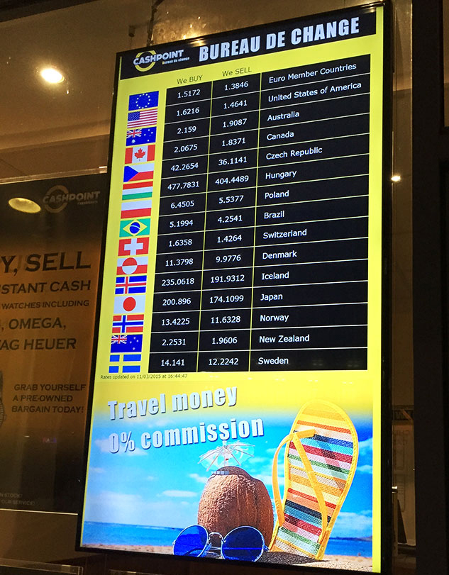
We’re so familiar with valuing money, everyone immediately grasps the purpose, significance and importance of such data, but let’s spell it out.
Take one unit – a dollar, a euro, a pound – and this listing shows what the world reckons it’s worth relative to another unit, at this time.
We know how this works, because we’ve learned – quite literally – the value of money.
This proves how seriously we take money. Forex traders try to game the system, but it’s pretty hard. The system is designed to be transparent, tamper-proof and robust.
Now take a look at this image
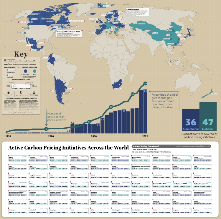
This graphic is an attempt by data visualisation specialists Visual Capitalist to explain how the top 70 carbon pricing mechanisms around the world value a different constant unit. Not a dollar, pound or euro in this case, but something even more tangible – a tonne of CO2 equivalent.
You may need to spend some time examining it, and even prolonged inspection may leave you none the wiser. This is because it makes no sense. Spend long enough trying to puzzle it out, and you discover that:
- one UK standard values a tonne of CO2 equivalent at US$99.98
- another UK standard reckons it’s US$23.65
- split the difference in Canada where it costs US$39.96
- in California it’s US$30.82
- but you can get 10x more carbon for your buck via a Mexican standard that reckons a tonne is worth US$3.72
- in Hubei, central China, it’s US$7.24
- go 760km west to Chongqing, it drops to US$5.65
- go 960km southeast to Fujian, and it’s only US$1.83
- best ‘value’ for your buck is Ukraine at US$1.03 which get you more than 100 times more carbon credit than Uruguay, where it’s US$137.30
- Does this look like we’re taking carbon seriously?
This chart exemplifies the folly of expecting a system that depends on competing commercial standards to provide rational outcomes, when it comes to carbon calculations. It’s full of numbers, and full of nonsense.
What can be done?
The short answer is we urgently need to start treating carbon as seriously as we treat money.
I set up See Through News to find fresh, accessible ways of explaining the urgency better, and driving people to effective climate action that measurably reduces carbon. The website is full of a variety of projects we have to meet the Goal of Speeding Up Carbon Drawdown by Helping the Inactive Become Active.
See Through News, realising there’s little point in claiming to measurably reduce carbon if we’re not measuring it properly, helped set up See Through Carbon, which on September 1st launched its first pilot. It aims to replace Carbon Auditing 1.0 – inaccurate, expensive, opaque, proprietary, greenwash-friendly – with a standard that’s accurate, free to use, transparent and open-source.
For details, visit the websites, See Through News and See Through Carbon. The devil, as we all know, is in the details.
But first we need to know and understand the numbers.