How tip-top data visualisation can aid effective climate action
Developing our video game Projects, in particular how to display the data we’re building up from our Think Game, we’re starting to appreciate the nascent art of data visualisation, known as Dataviz.
Many of us were introduced to the modern form of storytelling by Hans Rosling of the GapMinder Foundation, a pioneer in this form of visual storytelling.
Rosling’s charisma and energy lent a lot to his imaginative use of on-screen graphics and real-world props, but dataviz has become an art-form in itself. The best examples don’t need a charismatic presenter to be effective.
Social media has helped this high-quality dataviz spread so quickly, it’s become normalised within a few years; information-rich, visually-compelling images or short animations and Twitter/Facebook were a match made in Comms Heaven.
Like all technology, it’s just a tool, and can be used for Good or Evil – or from a See Through News perspective, to Speed Up or Slow Down Carbon Drawdown.
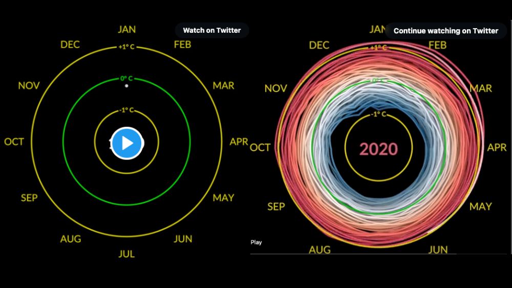
Here’s a favourite recent example, from NASA.
We're looking closer at the wonderful new art of #dataviz as we develop #TheThinkGame, AKA #SeeThroughNews60secondChallenge.
— See Through News (@SeeThroughNews) March 14, 2022
This @NASA vid is terrific in both senses – watch to the end. @IPCC_CH estimates the difference between +1.5 and +2deg could = 0.5Bn refugees. pic.twitter.com/ZBDTTyHNDc